26.07.2026
A fresh look for the whole app: CRM style, a faster repairs list and bigger text
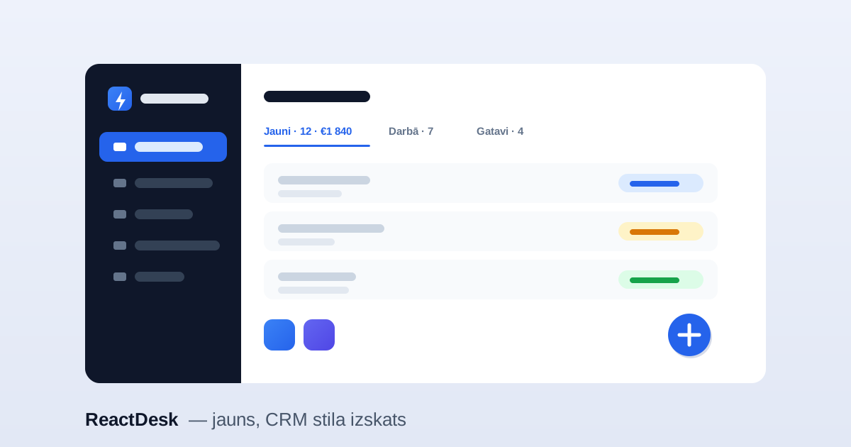
Since our last big update we took the whole app and redrew it — so the everyday work looks tidy and happens with fewer clicks. The devices, data and features are the same; what changed is the look and the speed. Here is the important part.
A new, CRM-style look
The sidebar is now dark navy with a blue active pill — you can tell at a glance which section you are in. Settings sections and window headers gained colourful gradient icon tiles, so the app looks like a proper CRM rather than a plain table.
A repairs list that works faster
Above the repairs list there are now underlined status tabs — each tab shows the number of repairs and their total value in euros. You can change a status straight from the list with a coloured pill — no need to open each repair one by one. And when you scroll a long list, a floating "+ new repair" button appears at the bottom, so you can add one from anywhere.
Bigger text and full screen width
We increased the base text size so the app no longer feels tiny, and the text-size switch (Aa) now goes even higher. Data pages — repairs, stock, clients — stretch to the full width of the tab, so you see more at once. Form pages (settings, account, billing) stay in a comfortable centred column.
Less clutter in the header
The language choice (LV / EN / RU) is now a compact globe dropdown instead of three buttons. On tablets and phones the header tools — showroom, text size, theme, language, tour — tuck behind a "⋯" button, so the search box keeps its room.
Stay signed in
The login screen now offers "Keep me signed in" — tick it and you will not have to type your password every time for the next two weeks. The first time it is confirmed with a code by e-mail, so the account stays safe.
Everything above is available right now — including on the free trial. Just sign in, and the new look is already waiting for you.